Aggregation
Showing the aggregated data is a common way to efficiently visualize a lot of data. This
task is usually done by the module specific group-by methods, but whitecanvas provides
a built-in method to simplify the process.
import numpy as np
from whitecanvas import new_canvas

rng = np.random.default_rng(12345)
df = {
    "category": ["A"] * 40 + ["B"] * 50,
    "observation": np.concatenate([rng.random(40), rng.random(50) + 1.3]),
    "replicate": [0] * 23 + [1] * 17 + [0] * 22 + [1] * 28,
    "temperature": rng.normal(scale=2.8, size=90) + 22.0,
}
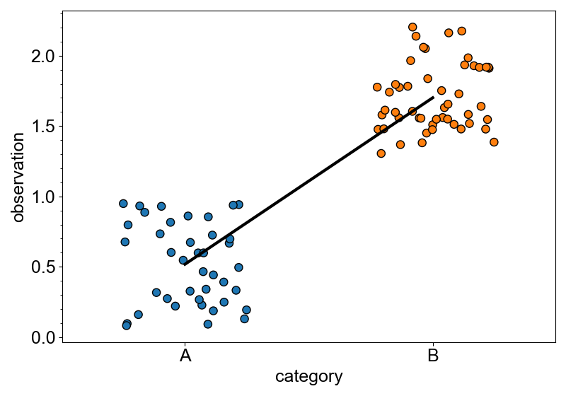
In following example, mean() is used to prepare a mean-aggregated plotter, which has
add_markers method to add the mean markers to the plotter.
canvas = new_canvas("matplotlib")

# create a categorical plotter
cat_plt = canvas.cat_x(df, x="category", y="observation")

# plot all the data
cat_plt.add_stripplot(color="category")
# plot the mean
cat_plt.mean().add_markers(color="category", size=20)

canvas.show()

Similar add_* methods include add_line() and add_bars().
canvas = new_canvas("matplotlib")

# create a categorical plotter
cat_plt = canvas.cat_x(df, x="category", y="observation")

# plot all the data
cat_plt.add_stripplot(color="category")
# plot the mean
cat_plt.mean().add_line(width=3, color="black")

canvas.show()
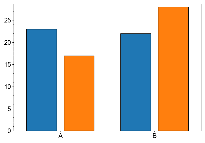
Count plot is a special case of the aggregation. Use count() to make the plotter.
canvas = new_canvas("matplotlib")
(
    canvas
    .cat_x(df, x="category")
    .count()
    .add_bars(color="replicate", dodge=True)
)
canvas.show()