Categorical × Numerical Data
In this section, following data will be used as an example:
import numpy as np
from whitecanvas import new_canvas

rng = np.random.default_rng(3)
df = {
    "category": ["A"] * 40 + ["B"] * 50,
    "observation": np.concatenate([rng.normal(2.0, size=40), rng.normal(3.3, size=50)]),
    "replicate": [0] * 23 + [1] * 17 + [0] * 22 + [1] * 28,
    "temperature": rng.normal(scale=2.8, size=90) + 22.0,
}
How can we visualize the distributions for each category? There are several plots that use categorical axis as either the x- or y-axis, and numerical axis as the other. Examples are:
- Strip plot
- Swarm plot
- Violin plot
- Box plot
Aside from the categorical axis, data points may further be grouped by other features, such as the marker symbol and the marker size. Things are even more complicated when the markers represent numerical values, such as their size being proportional to the value, or colored by a colormap.
whitecanvas provides a consistent and simple interface to handle all these cases.
Methods used for this purpose are cat_x and cat_y, where cat_x will deem the
x-axis as categorical, and cat_y will do the same for the y-axis.
canvas = new_canvas("matplotlib")

# create the categorical plotter.
cat_plt_x = canvas.cat_x(df, x="category", y="observation")
cat_plt_y = canvas.cat_y(df, x="observation", y="category")
cat_x and cat_y use the argument x= and y= to specify the columns that are used
for the plot, where x= is the categorical axis for cat_x and y= for cat_y.
This is one of the important difference between `seaborn`. In `seaborn`, `orient` are
used to specify the orientation of the plots. This design forces the user to add the
argument `orient=` to every plot even though the orientation rarely changes during the
use of the same figure. In `whitecanvas`, you don't have to specify the orientation
once a categorical plotter is created by either `cat_x` or `cat_y`.
Multiplt columns can be used for the categorical axis, but only one column can be used for the numerical axis.
# OK
canvas.cat_x(df, x=["category", "replicate"], y="observation")
# OK
canvas.cat_y(df, x="observation", y=["category", "replicate"])
# NG
canvas.cat_x(df, x="category", y=["observation", "temperature"])
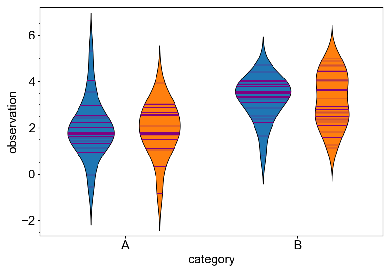
Non-marker-type Plots
Since plots without data point markers are more straightforward, we will start with
them. It includes add_violinplot, add_boxplot, add_pointplot and add_barplot.
canvas = new_canvas("matplotlib")
canvas.cat_x(df, x="category", y="observation").add_violinplot()
canvas.show()

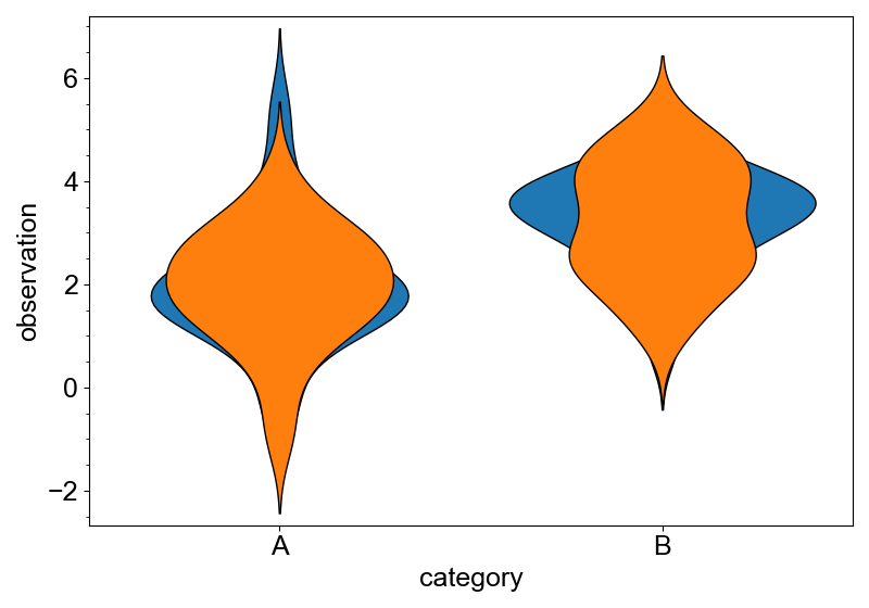
Violins can also be shown in different color. Specify the color= argument to do that.
canvas = new_canvas("matplotlib")
(
    canvas
    .cat_x(df, x="category", y="observation")
    .add_violinplot(color="replicate")
)
canvas.show()

By default, groups with different colors do not overlap. This is controlled by the
dodge= argument. Set dodge=False to make them overlap (although it is not the way
we usually do).
canvas = new_canvas("matplotlib")
(
    canvas
    .cat_x(df, x="category", y="observation")
    .add_violinplot(color="replicate", dodge=False)
)
canvas.show()
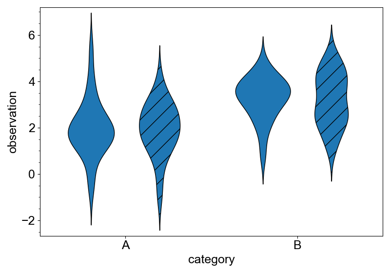
hatch= can also be specified in a similar way. It will change the hatch pattern of the
violins.
canvas = new_canvas("matplotlib")
(
    canvas
    .cat_x(df, x="category", y="observation")
    .add_violinplot(hatch="replicate")
)
canvas.show()
color and hatch can overlap with each other or the x= or y= argument.
canvas = new_canvas("matplotlib")
(
    canvas
    .cat_x(df, x="category", y="observation")
    .add_violinplot(color="category")
)
canvas.show()

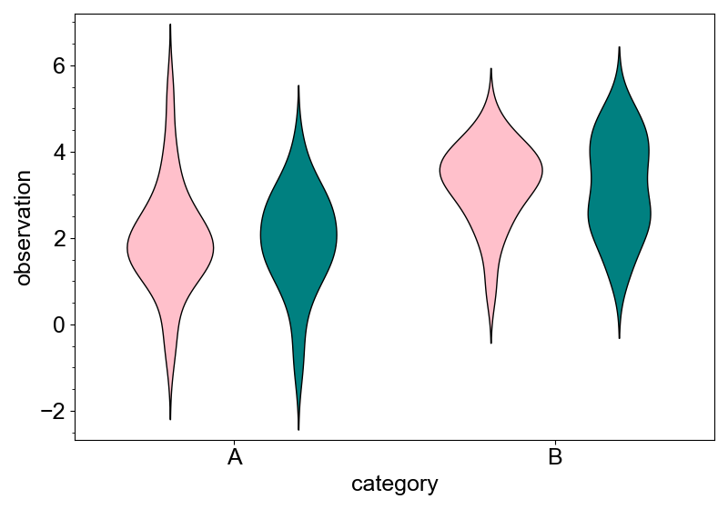
The color palette of the canvas is used to paint categories. If you want to change it
after the layer is added, use update_color_palette method.
canvas = new_canvas("matplotlib")
(
    canvas
    .cat_x(df, x="category", y="observation")
    .add_violinplot(color="replicate")
    .update_color_palette(["pink", "teal"])
)
canvas.show()
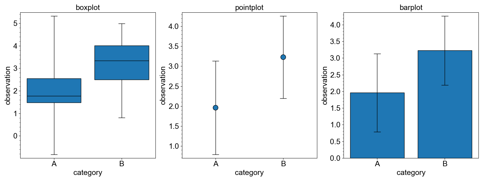
add_boxplot, add_pointplot and add_barplot is very similar to add_violinplot.
from whitecanvas import new_row

canvas = new_row(3, size=(1600, 600), backend="matplotlib")

c0 = canvas.add_canvas(0)
c0.cat_x(df, x="category", y="observation").add_boxplot()
c0.title = "boxplot"

c1 = canvas.add_canvas(1)
c1.cat_x(df, x="category", y="observation").add_pointplot()
c1.title = "pointplot"

c2 = canvas.add_canvas(2)
c2.cat_x(df, x="category", y="observation").add_barplot()
c2.title = "barplot"

canvas.show()
Marker-type Plots
Marker-type plots use a marker to represent each data point.
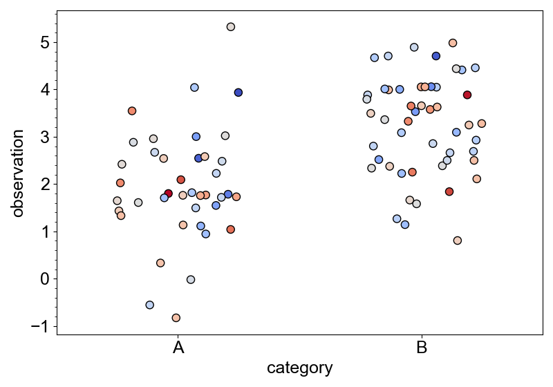
Strip plot
canvas = new_canvas("matplotlib")
(
    canvas
    .cat_x(df, x="category", y="observation")
    .add_stripplot(color="replicate")
)
canvas.show()

canvas = new_canvas("matplotlib")
(
    canvas
    .cat_x(df, x="category", y="observation")
    .add_stripplot(color="replicate", dodge=True)
)
canvas.show()

As for the Markers layer, as_edge_only will convert the face features to the edge features.
canvas = new_canvas("matplotlib")
(
    canvas
    .cat_x(df, x="category", y="observation")
    .add_stripplot(color="replicate", dodge=True)
    .as_edge_only(width=2)
)
canvas.show()

with_hover_template is also defined. All the column names can be used in the template
format string.
canvas = new_canvas("plotly", size=(400, 300))
(
    canvas
    .cat_x(df, x="category", y="observation")
    .add_stripplot(color="replicate", dodge=True)
    .with_hover_template("{category} (rep={replicate})")
)
canvas.show()
Each marker size can represent a numerical value. update_size will map the numerical
values of a column to the size of the markers.
canvas = new_canvas("matplotlib")
(
    canvas
    .cat_x(df, x="category", y="observation")
    .add_stripplot()
    .update_size("temperature")
)
canvas.show()

Similarly, each marker color can represent a numerical value. update_colormap will map
the value with an arbitrary colormap.
canvas = new_canvas("matplotlib")
(
    canvas
    .cat_x(df, x="category", y="observation")
    .add_stripplot()
    .update_colormap("temperature", cmap="coolwarm")
)
canvas.show()
Swarm plot
Swarm plot (or beeswarm plot) is another way to visualize all the data points with markers. In swarm plot, the outline of the markers represents the distribution of the data.
canvas = new_canvas("matplotlib")
(
    canvas
    .cat_x(df, x="category", y="observation")
    .add_swarmplot(sort=True)
    .update_colormap("temperature", cmap="coolwarm")
)
canvas.show()

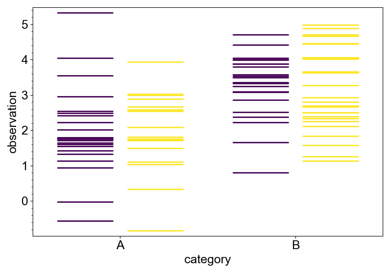
Rug plot
Although rug plot does not directly use markers, it also use a line to represent each data point.
canvas = new_canvas("matplotlib")
(
    canvas
    .cat_x(df, x="category", y="observation")
    .add_rugplot(color="replicate", dodge=True)
)
canvas.show()
Some methods defined for marker-type plots can also be used for rug plot. For example,
update_colormap will change the color of the rug lines based on the values of the
specified column.
canvas = new_canvas("matplotlib")
(
    canvas
    .cat_x(df, x="category", y="observation")
    .add_rugplot()
    .update_colormap("temperature", cmap="coolwarm")
)
canvas.show()

scale_by_density will change the length of the rugs to represent the density of the
data points.
canvas = new_canvas("matplotlib")
(
    canvas
    .cat_x(df, x="category", y="observation")
    .add_rugplot(color="replicate", dodge=True)
    .scale_by_density()
)
canvas.show()

Overlaying Plots
Different types of plots have their own strengths and weaknesses. To make the plot more informative, it is often necessary to overlay different types of plots.
You can simply call different methds to overlay different types of plots, but in some cases it is not that easy. For example, to add rug plot to violin plot, you have to correctly set the lengths of the rug lines so that their edges exactly match the edges of the violins.
Some types of plots are implemented with methods to efficiently overlay them with other plots. All of them use method chaining so that the API is very clean.
Rug plot over violin plot
Violin plot can be overlaid with rug plot using with_rug method. Edges of the rug lines match exactly with the edges of the violins. Of cource, you can hover over the rug lines to see the details.
canvas = new_canvas("matplotlib")
(
    canvas
    .cat_x(df, x="category", y="observation")
    .add_violinplot(color="replicate")
    .with_rug(color="purple")
)
canvas.show()
Box plot over violin plot
Violin plot can be overlaid with box plot using with_box method. Color of the box plot
follows the convention of other plotting softwares by default.
canvas = new_canvas("matplotlib")
(
    canvas
    .cat_x(df, x="category", y="observation")
    .add_violinplot(color="replicate")
    .with_box(width=2.0, extent=0.05)
)
canvas.show()

If the violins are edge only, the box plot will be filled with the same color.
canvas = new_canvas("matplotlib")
(
    canvas
    .cat_x(df, x="category", y="observation")
    .add_violinplot(color="replicate")
    .as_edge_only()
    .with_box(width=2.0, extent=0.05)
)
canvas.show()

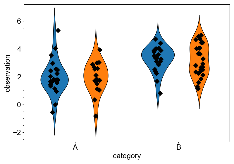
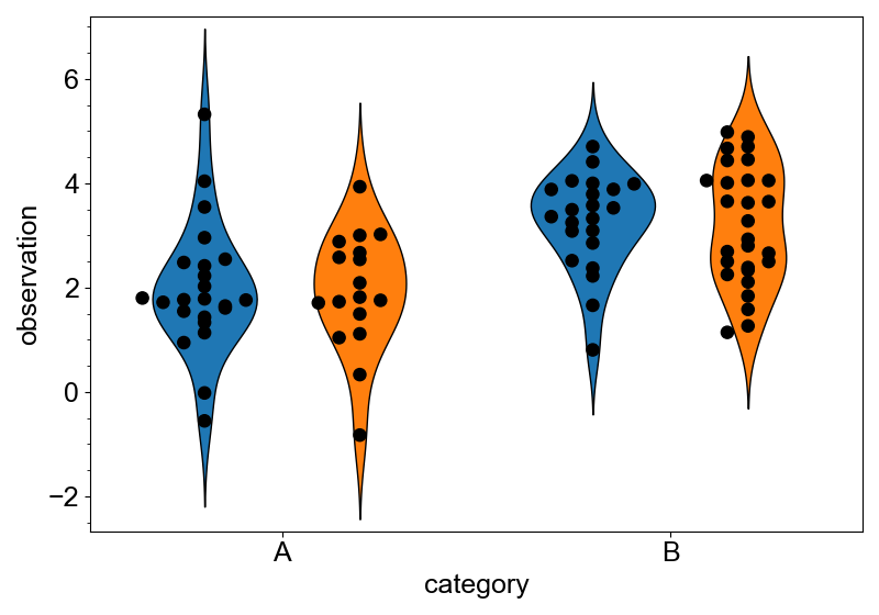
Markers over violin plot
Violin plot has with_strip and with_swarm methods to overlay markers.
canvas = new_canvas("matplotlib")
(
    canvas
    .cat_x(df, x="category", y="observation")
    .add_violinplot(color="replicate")
    .with_strip(symbol="D", size=8, color="black")
)
canvas = new_canvas("matplotlib")
(
    canvas
    .cat_x(df, x="category", y="observation")
    .add_violinplot(color="replicate")
    .with_swarm(size=8, color="black")
)
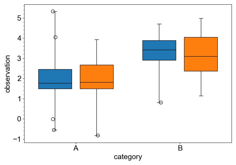
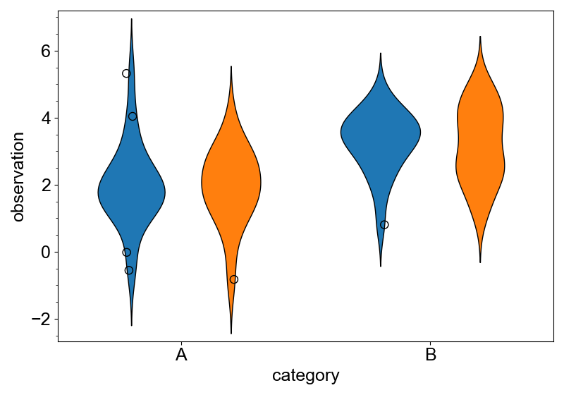
Add outliers
Box plot and violin plot are usually combined with outlier markers, as these plots are
not good at showing the details of the sparse data points.
For these plots, with_outliers method will add outliers, and optionally change the
whisker lengths for the box plot.
This is the example of adding outliers to the box plot. Because outliers are shown as a
strip plot, arguments specific to strip plot (symbol, size, extent and seed) can be used.
canvas = new_canvas("matplotlib")
(
    canvas
    .cat_x(df, x="category", y="observation")
    .add_boxplot(color="replicate")
    .with_outliers(size=8)
)

If the box plot is edge only, the outliers will be the same.
canvas = new_canvas("matplotlib")
(
    canvas
    .cat_x(df, x="category", y="observation")
    .add_boxplot(color="replicate")
    .as_edge_only()
    .with_outliers()
)
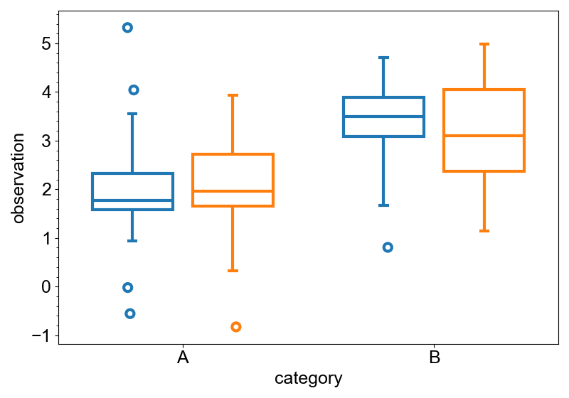
Setting update_whiskers to False will not change the whisker lengths.
canvas = new_canvas("matplotlib")
(
    canvas
    .cat_x(df, x="category", y="observation")
    .add_boxplot(color="replicate")
    .with_outliers(update_whiskers=False)
)
Violin plot also supports with_outliers method.
canvas = new_canvas("matplotlib")
(
    canvas
    .cat_x(df, x="category", y="observation")
    .add_violinplot(color="replicate")
    .with_outliers(size=8)
)
Sort categorical axis
By default, the order of the categories is determined by the order of appearance in the
data. In the example data, the order of "category" is "A" and "B".
If you want to sort the categories as you like, you can use the sorting methods of the categorical plotters.
Sort in ascending or descending order
The sort method will sort the categories in ascending or descending order. The default
is ascending. Use ascending=False to sort in descending order.
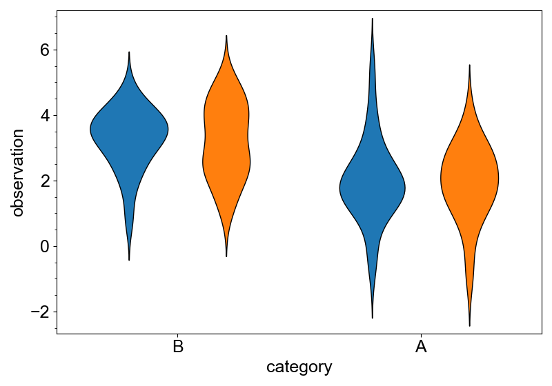
canvas = new_canvas("matplotlib")
(
    canvas
    .cat_x(df, x="category", y="observation")
    .sort(ascending=False)
    .add_violinplot(color="replicate")
)
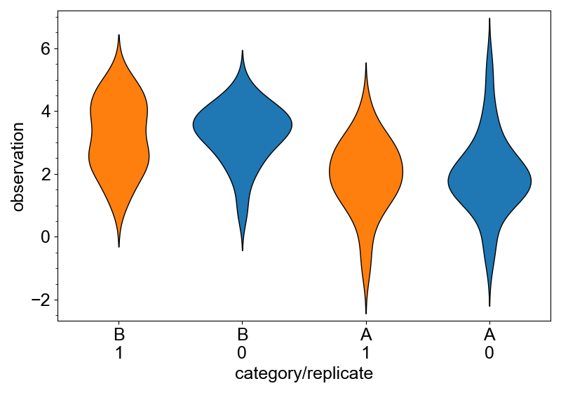
Sorting works similarly for the categorical axis with multiple columns.
canvas = new_canvas("matplotlib")
(
    canvas
    .cat_x(df, x=["category", "replicate"], y="observation")
    .sort(ascending=False)
    .add_violinplot(color="replicate")
)
Sort in any order
If you already know the category names and want to sort them in a certain order, use the
sort_in_order method.
canvas = new_canvas("matplotlib")
(
    canvas
    .cat_x(df, x="category", y="observation")
    .sort_in_order(["B", "A"])
    .add_violinplot(color="replicate")
)
