Markers
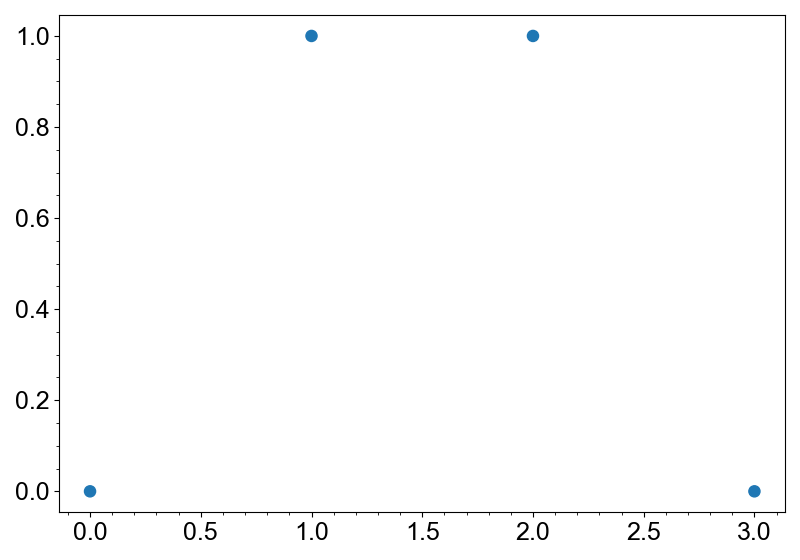
Markers is a layer for scatter plots. It can be created with the add_markers method.
import numpy as np
from whitecanvas import new_canvas

canvas = new_canvas("matplotlib")
layer = canvas.add_markers([0, 1, 2, 3], [0, 1, 1, 0])
canvas.show()
Symbol and size of the markers can easily be configured with the symbol and size
arguments.
import numpy as np
from whitecanvas import new_canvas

canvas = new_canvas("matplotlib")
for i, symbol in enumerate(["o", "s", "x", "+"]):
    for j, size in enumerate([5, 10, 15, 20]):
        x = [i - 0.2, i - 0.2, i + 0.2, i + 0.2]
        y = [j - 0.2, j + 0.2, j - 0.2, j + 0.2]
        layer = canvas.add_markers(x, y, symbol=symbol, size=size)
canvas.show()
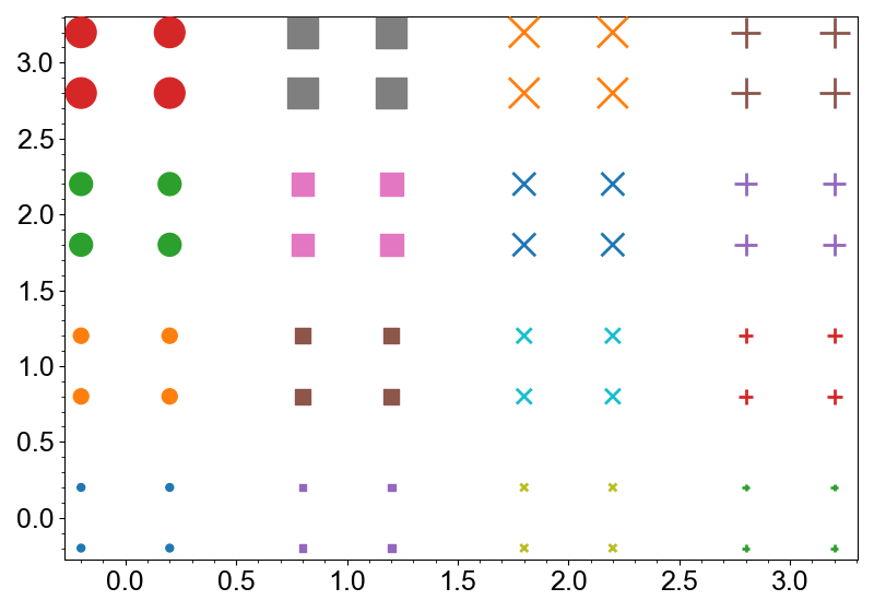
Note
If the symbol is edge-only, its color and visibility are automatically updated to ensure the markers are informative.
Marker Properties
Markers layer has two namespaces: face and edge. face has following properties:
color... color of the faces. Any color-like object is accepted.hatch... hatch pattern of the faces. Should be one of"","-","|,"+","/","\\","x"or".".
Note
hatch is not supported in some backends.
edge has following properties:
color... color of the lines. Any color-like object is accepted.width... width of the lines. Should be a non-negative number.style... style of the lines. Should be one of"-",":","-.","--".
Note
style is not supported in some backends.
Methods for adding these layers always configure the face properties with the
arguments. You can use the with_edge method of the output layer to set edge
properties. This separation is very helpful to prevent the confusion of the arguments,
especially the colors.
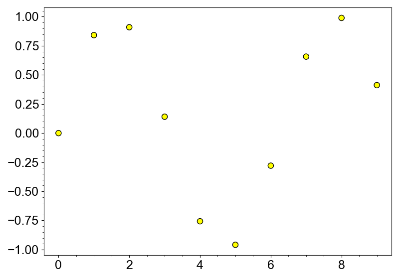
import numpy as np
from whitecanvas import new_canvas

canvas = new_canvas("matplotlib")

canvas.add_markers(np.sin(np.arange(10)), color="yellow").with_edge(color="black")
canvas.show()
All the properties can be set via properties of face and edge, or the update
method.
layer.face.color = "yellow"
layer.face.hatch = "x"

layer.edge.color = "black"
layer.edge.width = 2
layer.edge.style = "--"

# use `update`
layer.face.update(color="yellow", hatch="x")
layer.edge.update(color="black", width=2, style="--")
Multi-face and Multi-edge Markers
Markers supports multi-face and multi-edge. This means that you can create a layer
with multiple colors, widths, etc.
To do this, you have to call with_face_multi or with_edge_multi method.
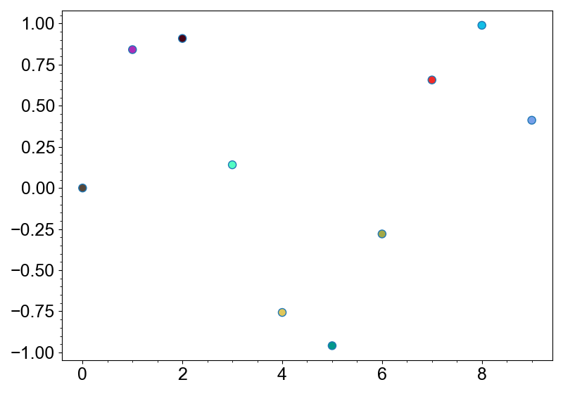
Here's an example of Markers with multi-faces.
import numpy as np
from whitecanvas import new_canvas

canvas = new_canvas("matplotlib")

layer = (
    canvas
    .add_markers(np.arange(10), np.sin(np.arange(10)))
    .with_face_multi(color=np.random.random((10, 3)))  # random colors
)
canvas.show()
After calling with_face_multi, the layer face property will return arrays instead
of scalar values.
layer.face.color  # (N, 4) array of RGBA colors
layer.face.hatch  # (N,) array of hatchs
layer.face.alpha # (N,) array of alpha values
Note
IDE can detect whether a Markers layer is multi-face or not. Markers class
is a generic class with type variables for the face types. Since with_face_multi
is correctly typed, IDE will recognize the returned layer as a multi-face layer.
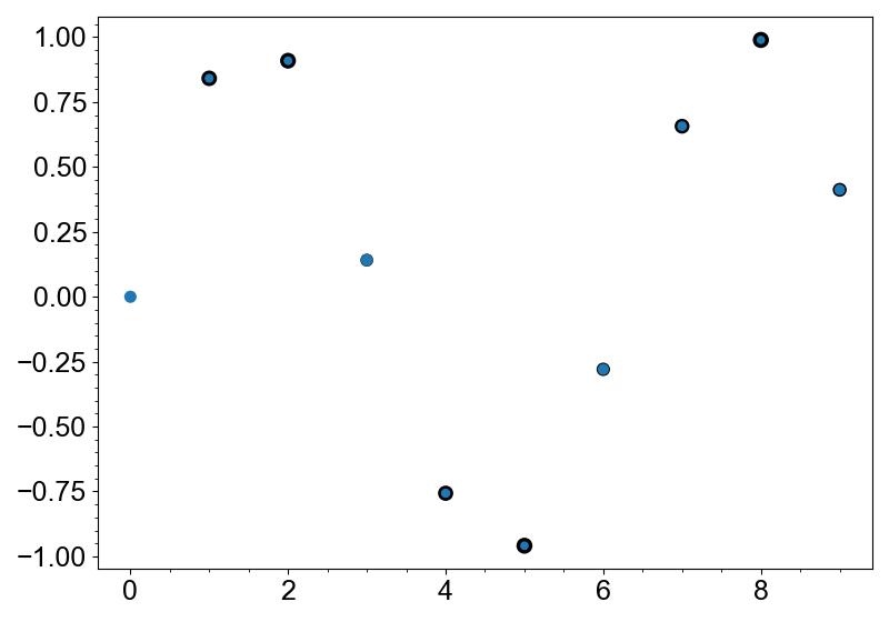
Similarly, you can use with_edge_multi to create multi-edge markers.
import numpy as np
from whitecanvas import new_canvas

canvas = new_canvas("matplotlib")

layer = (
    canvas
    .add_markers(np.arange(10), np.sin(np.arange(10)))
    .with_edge_multi(width=np.abs(np.sin(np.arange(10))) * 2.5)
)
canvas.show()
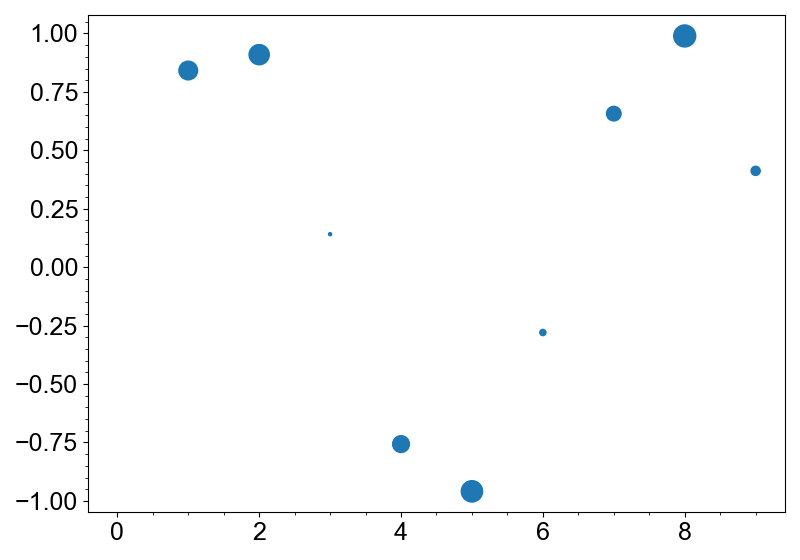
Multi-size Markers
with_size_multi method can be used to create multi-size markers.
import numpy as np
from whitecanvas import new_canvas

canvas = new_canvas("matplotlib")

layer = (
    canvas
    .add_markers(np.arange(10), np.sin(np.arange(10)))
    .with_size_multi(np.abs(np.sin(np.arange(10))) * 16)
)
canvas.show()
Methods for Better Interpretability
Markers is implemented with the following methods to make the plot more interpretable.
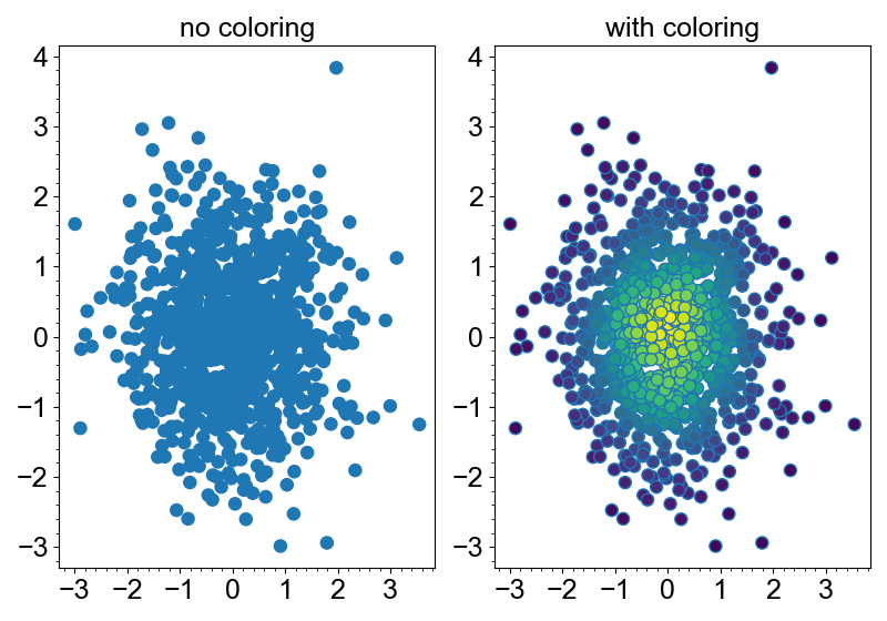
Color by density
Scatter plot is good at visualizing the outliers, but not at telling the distribution
when the density is high. In this case, color_by_density method is very useful. It
colors the markers by the density of the points using kernel density estimation.
import numpy as np
from whitecanvas import new_row

rng = np.random.default_rng(999)
x = rng.normal(size=1000)
y = rng.normal(size=1000)

grid = new_row(2, backend="matplotlib")
(
    grid
    .add_canvas(0)
    .update_labels(title="no coloring")
    .add_markers(x, y)
)
(
    grid
    .add_canvas(1)
    .update_labels(title="with coloring")
    .add_markers(x, y)
    .color_by_density(cmap="viridis")
)
grid.show()