Numerical × Numerical Data
Categorical Lines and Markers
Line plot and scatter plot use numerical values for both x and y axes. In this case, the plot is categorized by such as color, marker symbol, etc.
from whitecanvas import new_canvas

# sample data
df = {
    "label": ["A"] * 5 + ["B"] * 5,
    "x": [0, 1, 2, 3, 4, 0, 1, 2, 3, 4],
    "y": [3, 1, 2, 4, 3, 5, 3, 3, 1, 2],
    "some-info": ["a", "b", "c", "d", "e", "f", "g", "h", "i", "j"],
}
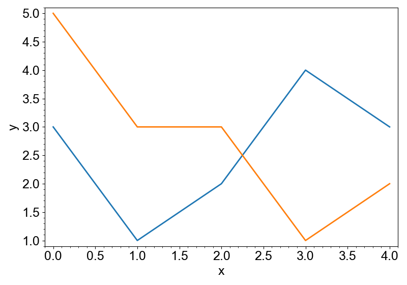
By setting color= to one of the column name, lines are split by the column and
different colors are used for each group.
canvas = new_canvas("matplotlib")
canvas.cat(df, "x", "y").add_line(color="label")
canvas.show()
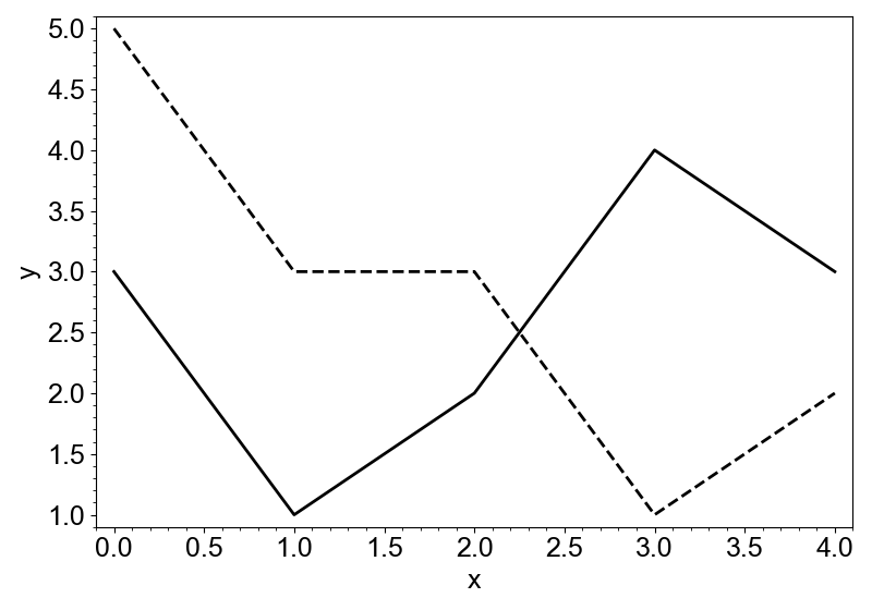
By setting style=, different line styles are used instead. In the following example,
color="black" means that all the lines should be the same color (black).
canvas = new_canvas("matplotlib")
canvas.cat(df, "x", "y").add_line(color="black", style="label")
canvas.show()
In the case of markers, you can use symbols to distinguish groups.
canvas = new_canvas("matplotlib")
canvas.cat(df, "x", "y").add_markers(symbol="label")
canvas.show()
The layers implement hover texts by default, based on the input data frame.
canvas = new_canvas("plotly", size=(400, 300))
canvas.cat(df, "x", "y").add_markers(color="label")
canvas.show()
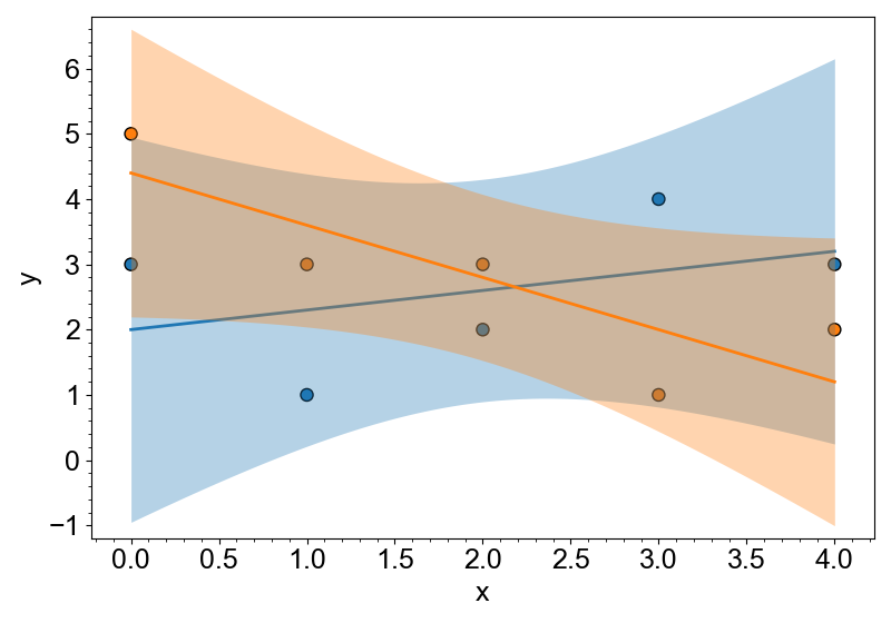
Group-wise line regression can be easily added by with_reg method.
canvas = new_canvas("matplotlib")
(
    canvas.cat(df, "x", "y")
    .add_markers(color="label")
    .with_reg()
)
canvas.show()
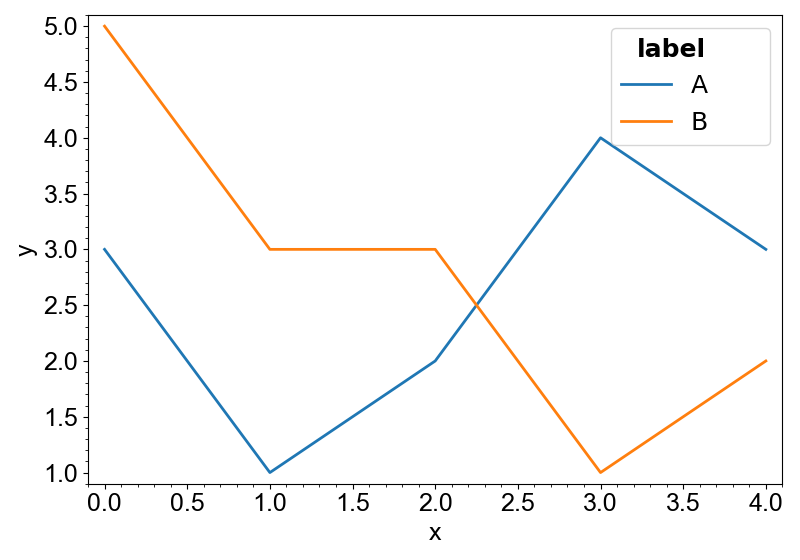
Automatic Creation of Legends
As mentioned in Legend for the Layers, legends can be
automatically created by add_legend function. In the case of the categorical plot,
the legend is created based on the categories.
canvas = new_canvas("matplotlib")
canvas.cat(df, "x", "y").add_line(color="label")
canvas.add_legend()
canvas.show()
Distribution of Numerical Data
There are several ways to visualize the distribution of numerical data.
- Histogram
- Kernel Density Estimation (KDE)
These representations only use one array of numerical data. Therefore, either x or y should be empty in the cat method.
import numpy as np

rng = np.random.default_rng(12345)

# sample data
steps = np.array([0] * 60 + [3] * 30 + [6] * 40)
df = {
    "label": ["A"] * 60 + ["B"] * 30 + ["C"] * 40,
    "X": rng.normal(loc=0.0, size=130) + steps,
    "Y": rng.normal(loc=1.0, size=130) + steps / 2,
}
x="X" means that the x-axis being "X" and the y-axis being the count.
Arguments forwards to the histogram method of numpy.
canvas = new_canvas("matplotlib")
canvas.cat(df, x="X").add_hist(bins=10)
canvas.show()

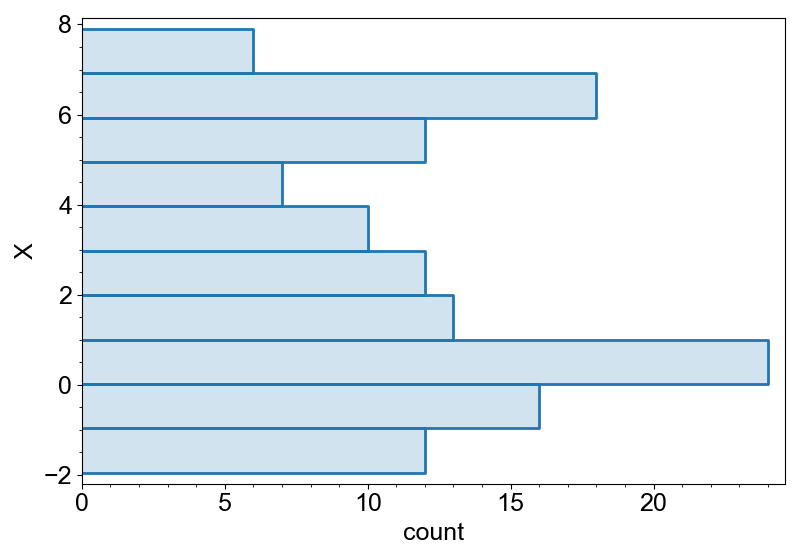
To transpose the histogram, use y="X".
canvas = new_canvas("matplotlib")
canvas.cat(df, y="X").add_hist(bins=10)
canvas.show()
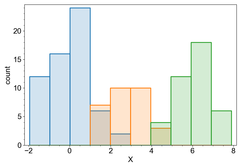
Histograms can be grouped by color.
canvas = new_canvas("matplotlib")
canvas.cat(df, x="X").add_hist(bins=10, color="label")
canvas.show()
If both x and y are set, the plotter cannot determine which axis to use. To tell
the plotter which axis to use, call along_x() or along_y() to restrict the
dimension.
canvas = new_canvas("matplotlib")
# canvas.cat(df, x="label", y="X").add_hist(bins=10)  # This will raise an error
canvas.cat(df, x="label", y="X").along_y().add_hist(bins=10)
canvas.show()

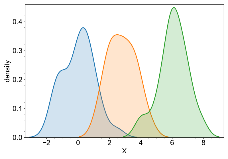
KDE can be similarly added.
canvas = new_canvas("matplotlib")
canvas.cat(df, x="X").add_kde(color="label")
canvas.show()
2-dimensional histogram can be added by add_hist2d.
canvas = new_canvas("matplotlib")
canvas.cat(df, x="X", y="Y").add_hist2d(bins=(8, 10), color="label")
canvas.show()

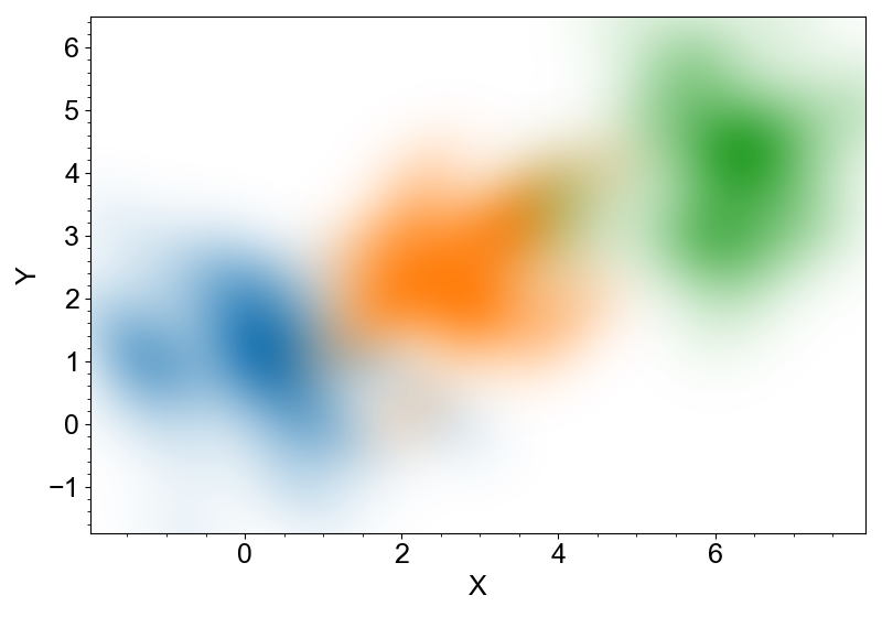
and similarly, 2-dimensional KDE can be added by add_kde2d.
canvas = new_canvas("matplotlib")
canvas.cat(df, x="X", y="Y").add_kde2d(color="label")
canvas.show()
Note
add_hist and add_hist2d returns completely different objects (histogram and
heatmap) and they are configured by different arguments. That's why whitecanvas
split them into two different methods.